[ Filed under More & in the Art of Design category ]
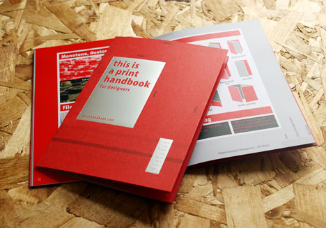
Regular readers will know that Dornob rarely does explicit reviews or contests, but this beautifully designed booklet warranted an exception. Tweet about or share this post on Facebook for a chance to win your own handy guide for turning digital designs into physical reality.
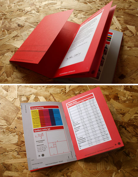
This is a print handbook for designers is not meant to be a comprehensive survey of the history of typography nor a definitive compendium of best practices. Rather, as with many well-crafted written works, the key to this neat little pocketbook is also a universal design lesson: namely, that less is more.
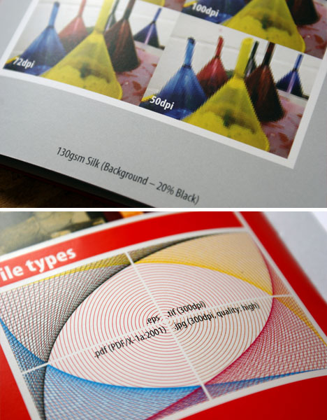
It covers overprinting, the golden ratio and papers sizes to start with, then shows sample colors, line weights and examples of different DPIs (dots per inch). File types, monotone, duotone, tritone and so forth are shown side by side for comparison, while different methods of folding are illustrated on a single page. Typefaces, conversions, color tints and legibility issues close out the volume. Even the clever cover shows different dimensions, working as a ruler when the book is closed or open.
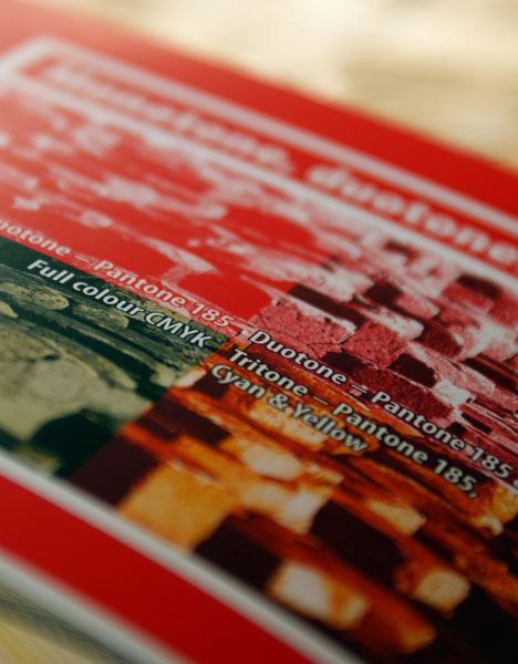
For four, five or six pounds (depending upon shipping destination), this nifty volume can slip onto your shelf or into a drawer for reference – or, again, if you want a shot at a free copy, simply share this article or a link to printhandbook.com with a reference to Dornob so we can spot it (e.g. #DornobDesign on Twitter). Definitely a great little gift for folks who work in or around print fields, but really, an invaluable (not to mention cute and classy) resource for anyone who prints anything.


[ Filed under More & in the Art of Design category ]
[ Dornob | Archives | Categories | Privacy | TOS ]
Dornob

